Nordic Partners Branding and Adverts
Nordic Partners is a new brand that helps iGaming affiliates find the best offers and also provides innovative tools and tailored campaigns.
They have asked iGaming Studio to deliver a professional branding and advertisements for a seamless launch.
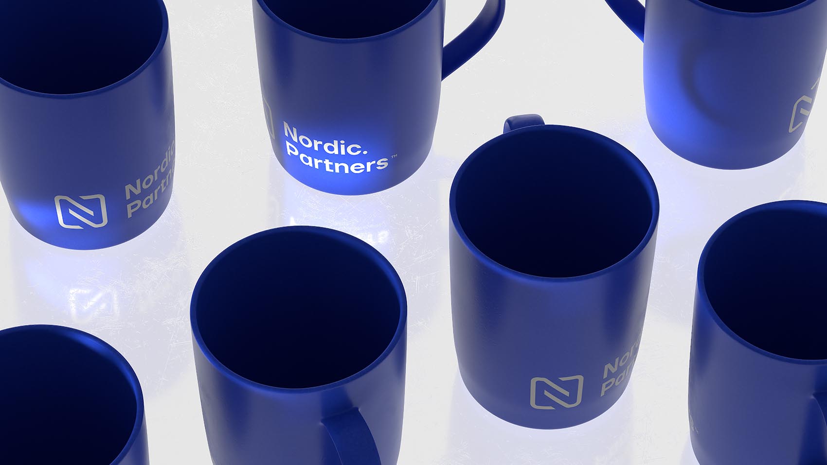
Branding Nordic Partners
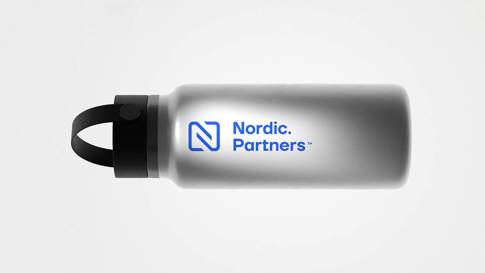
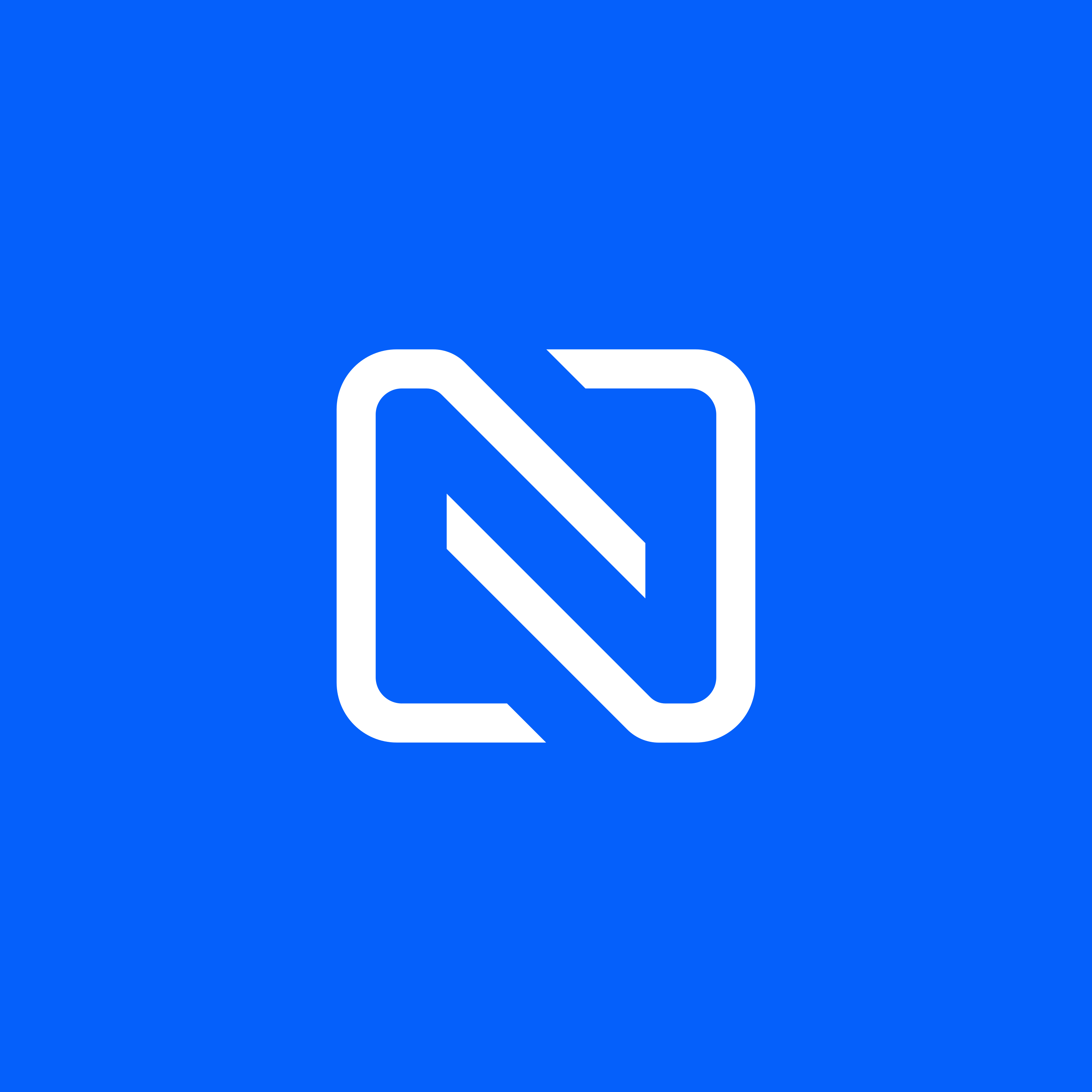
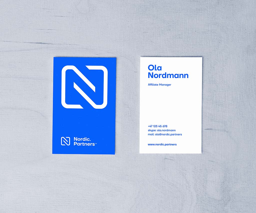
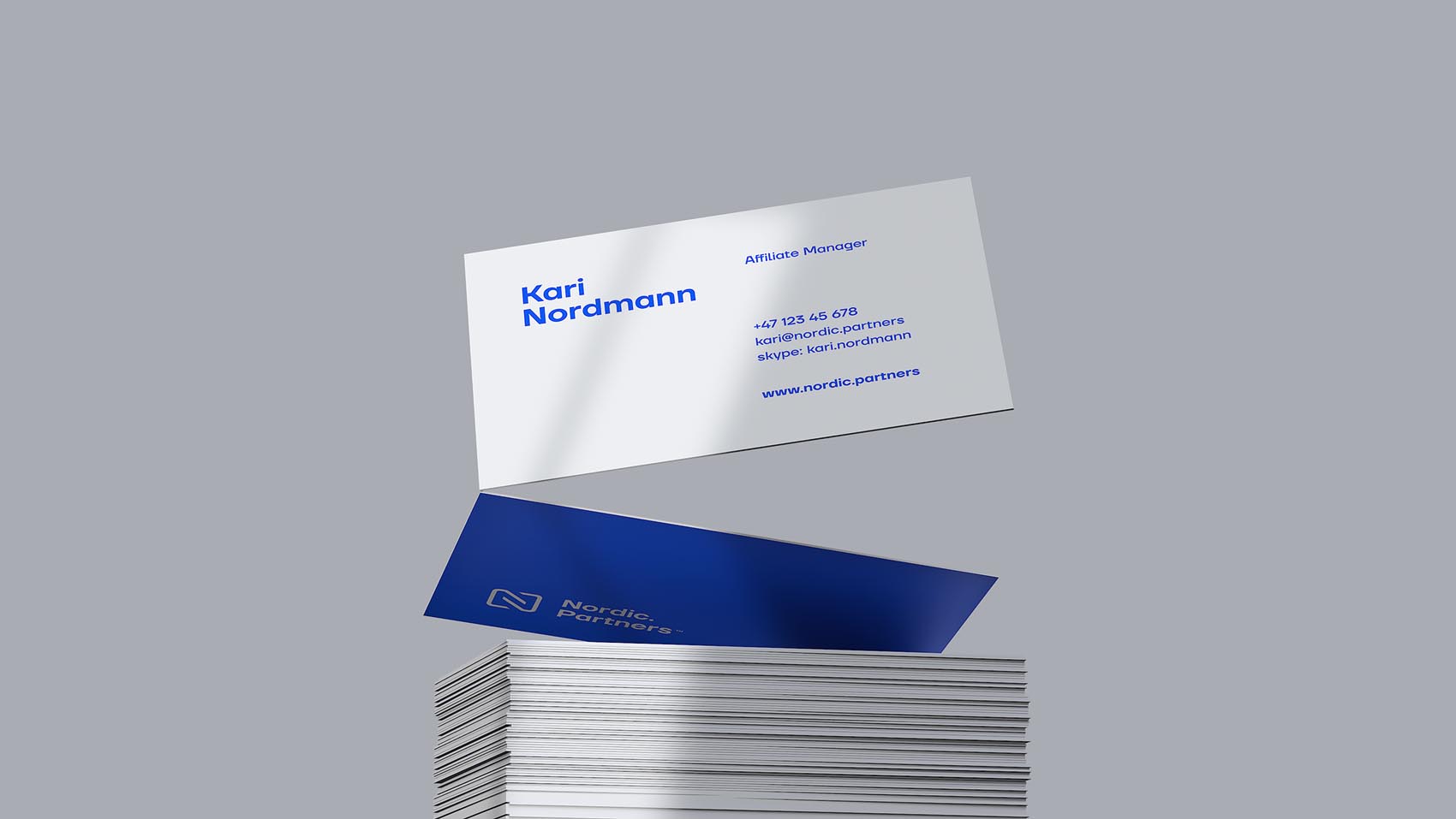
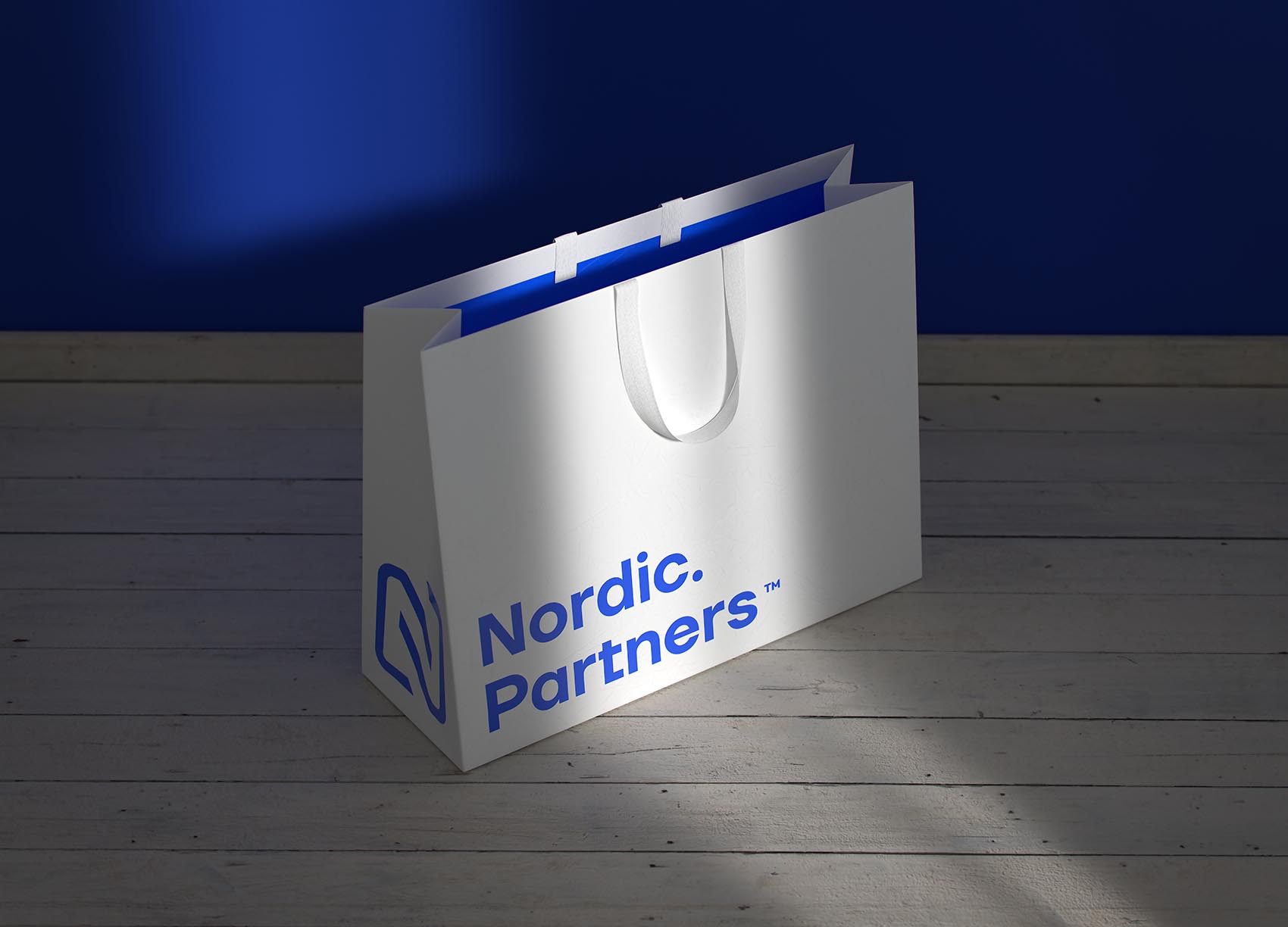
The logo design of Nordic Partners symbolises a bond that partners have and also shapes the letter "N" that stands for "Nordic". It also has a hidden symbol that becomes visible if viewed as a negative space iconography; the middle part of the logo also depicts a blue and a white line twisting around each other, which also symbolises partnership. We have also delivered two variations for the business card design to offer a strong variant and a subtle minimalist version.
Nordic Partners Advertisements
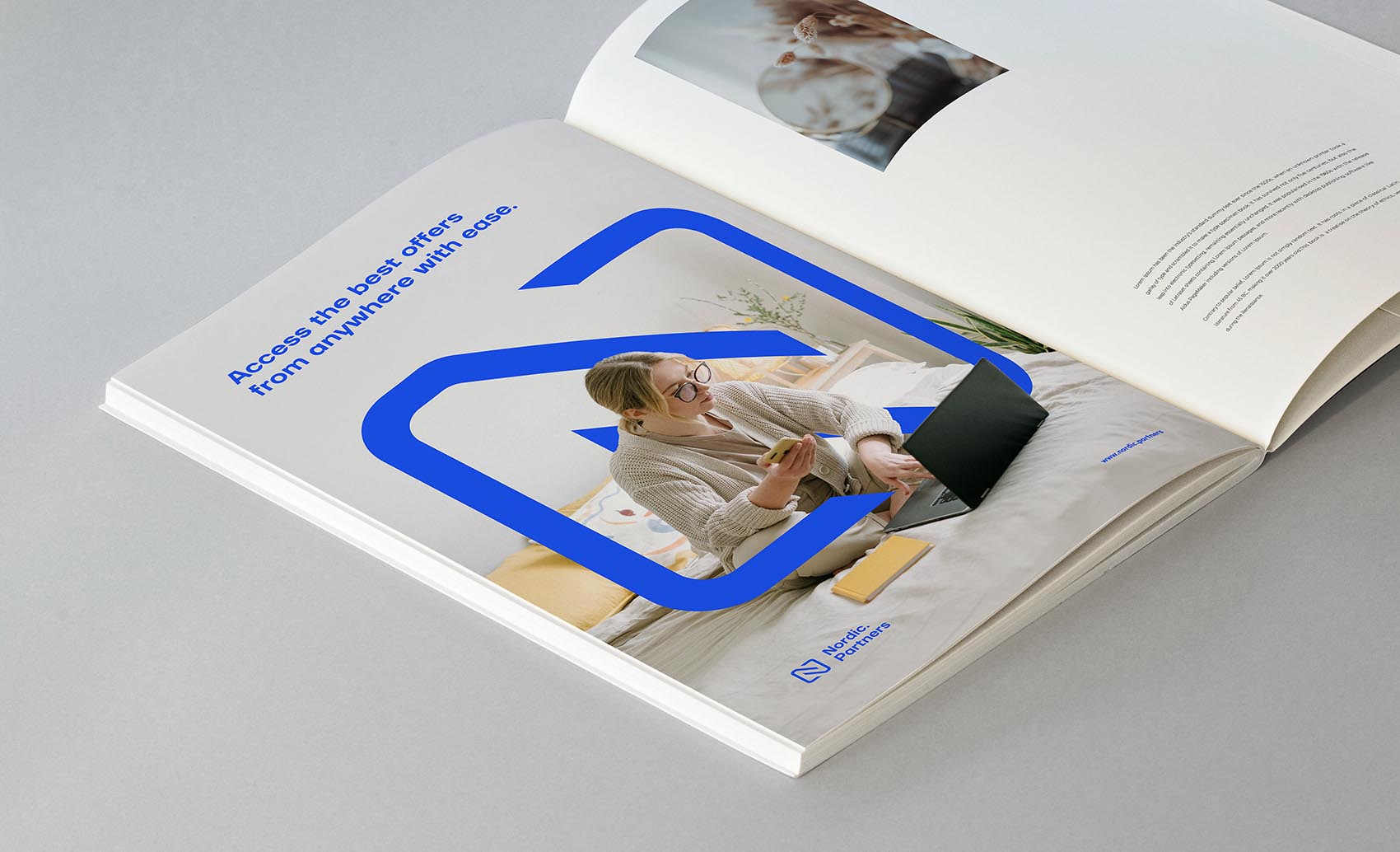
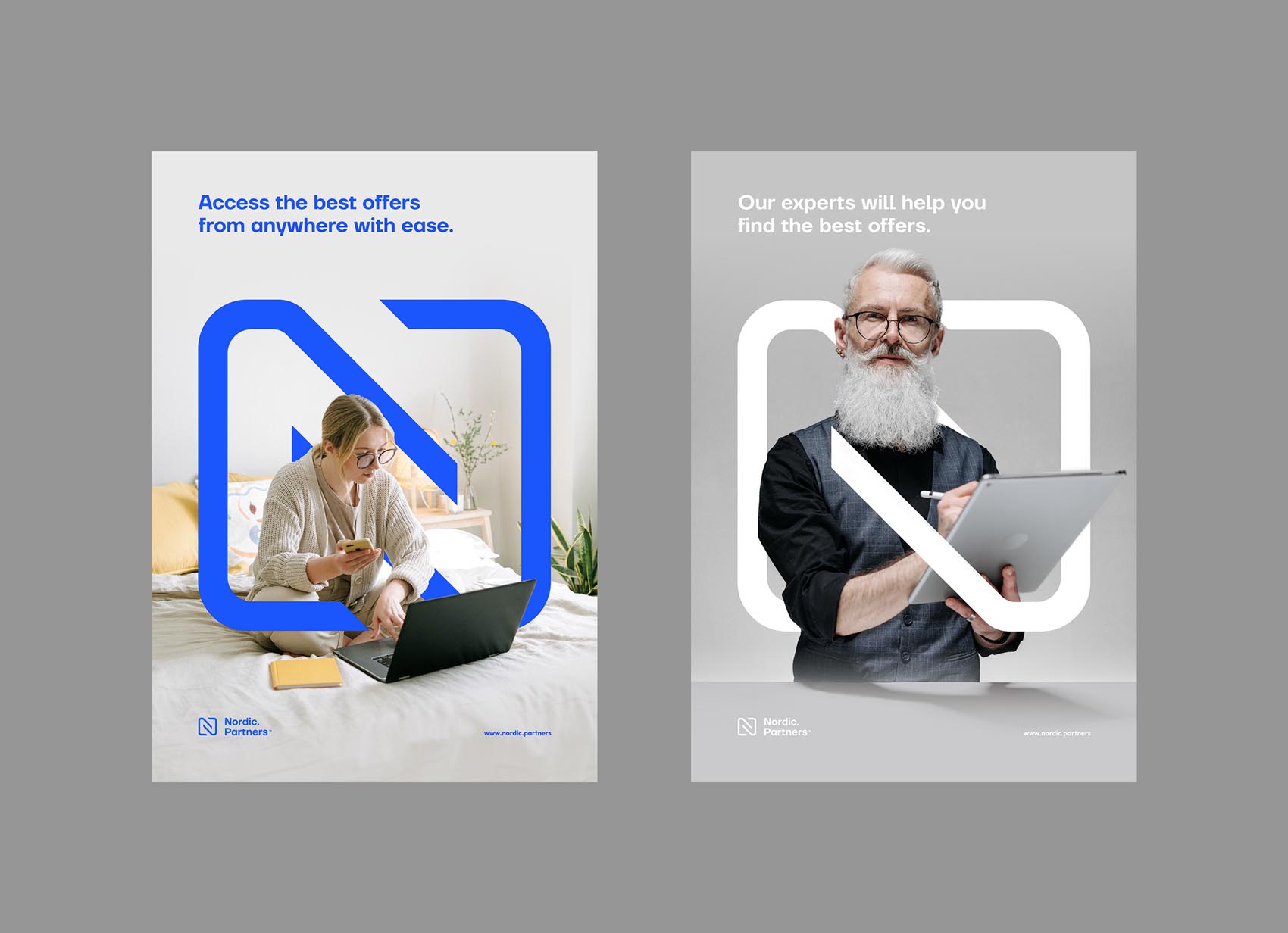
The advertisement designs use the shape of the logo in a layered way to create a depth effect. One end of the line goes above and the other end below the person or object that the advert contains, creating a subtle but exciting effect. This works well with both humans and objects; it adds a unique depth to the brand's advertisements, and also uses the logo in a large format that imeddiately shows who is the advertiser, without
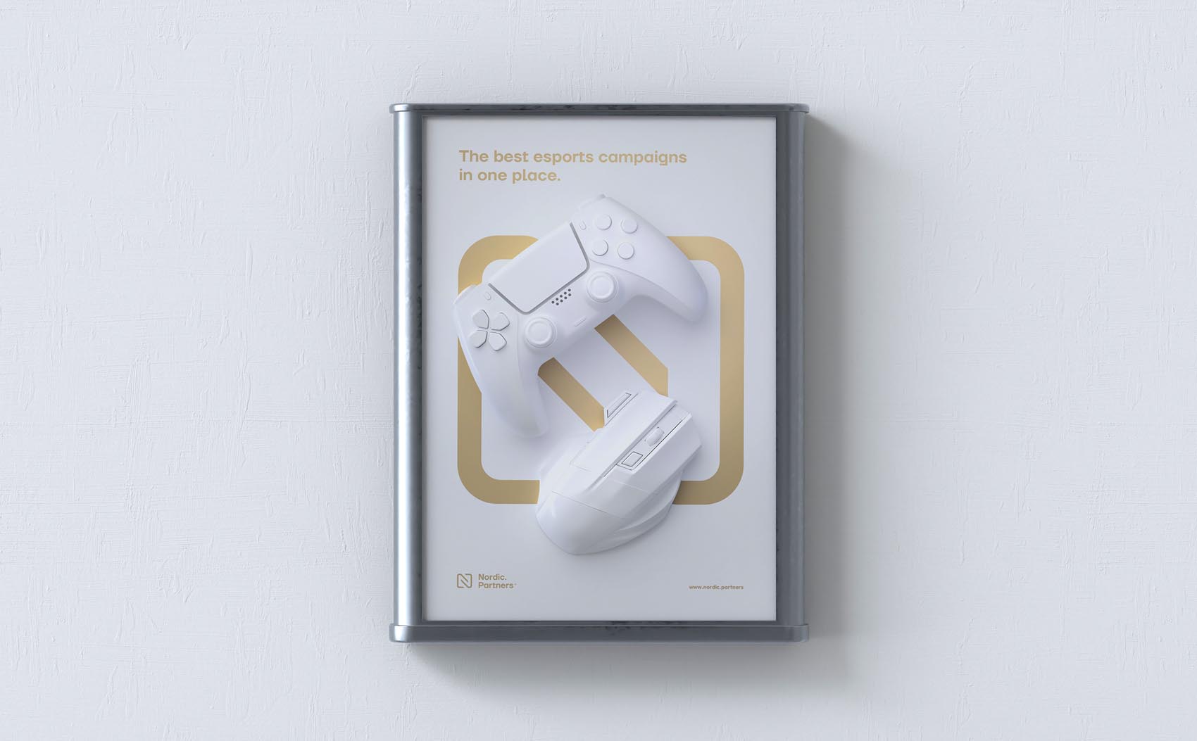
A great branding requires clients with an open mind, and to be ready to explore new styles. Nordic Partners are run by industry veterans who have a vision for the future and wanted something fresh and memorable.
Some of Our Affiliate Projects
Ready to start a new project?
Please write about your vision to:


© iGaming Studio